Forms, booking pages, and internal request flows are often treated as small details. In reality, they are some of the most important digital touchpoints in a business. A customer enquiry form, appointment booking page, project request form, content brief, or support handover process can either make work easier or create confusion before the real service even begins.
This UX checklist for business forms is designed for business owners, marketing managers, content teams, and operations teams who want to reduce friction without rebuilding everything from scratch. The goal is simple: make every form, booking step, and internal request flow clear, useful, and easy to complete.
Why business forms and request flows become confusing
Most form and booking problems do not happen because teams are careless. They happen because tools are added one by one. A website form connects to email. A booking link connects to a calendar. A file request happens on WhatsApp. A content brief lives in a spreadsheet. Approvals happen somewhere else. Over time, users are forced to move between disconnected steps, and the business loses visibility.
Good UX/UI Design looks at the full journey, not only the screen. A form should collect the right information. A booking flow should explain what happens next. An internal request flow should guide the team from request to action without repeated follow-ups.
The practical UX checklist for business forms
1. Start with the purpose of the form
Before changing fields or colours, ask what the form is meant to achieve. Is it for sales enquiries, support requests, bookings, project briefs, content requests, job applications, or internal approvals? A form with no clear purpose usually collects too much information and still misses what the team actually needs.
- Check: Can your team explain what happens after this form is submitted?
- Improve: Remove fields that do not help the next person take action.
- Example: A website enquiry form may only need name, contact details, service interest, budget range, timeline, and message instead of a long questionnaire.
2. Reduce fields, but keep decision-making information
A short form is not automatically a good form. A good form asks for enough information to move the work forward without making the user feel overloaded. The best form UX checklist balances speed with usefulness.
- Check: Which fields are essential, useful, optional, or unnecessary?
- Improve: Group optional details under a clear secondary section.
- Example: For a booking flow, ask for service type, preferred date, contact details, and one short note. Save deeper discovery questions for after the booking is confirmed.
3. Make the next step visible
Many users complete a form and then wonder what happens next. This creates repeated emails, calls, and support questions. Clear next-step messaging is one of the easiest ways to improve booking flow design and reduce confusion.
- Check: Does the confirmation page explain what will happen next?
- Improve: Show response time, delivery expectations, required documents, or next communication channel.
- Example: Instead of a plain thank-you message, say that the team will review the request and respond with available time slots or next actions.
4. Design for the person completing the form
Business teams often design forms around internal needs only. Better UX starts with the user journey. A customer, supplier, staff member, or content requester may not know your internal terminology, service categories, or approval structure.
- Check: Are labels written in plain language?
- Improve: Replace internal terms with words the user already understands.
- Example: Use project deadline instead of required completion SLA, or type of content instead of asset category.
5. Break complex flows into clear steps
Long forms, booking pages, and internal request flows can feel easier when they are divided into logical stages. This is especially useful for service bookings, project requests, creative briefs, support tickets, and onboarding flows.
- Check: Can the flow be separated into details, requirements, files, review, and confirmation?
- Improve: Use step-by-step sections with clear progress.
- Example: A content request flow can move from campaign details to channel selection, then asset upload, deadline, approval person, and final confirmation.
6. Remove repeated manual follow-ups
If your team keeps asking the same questions after a form is submitted, the form is not supporting the workflow properly. Internal request flow UX should reduce repeated messages, not create another inbox to manage.
- Check: What questions does the team ask again and again?
- Improve: Add those questions to the right stage of the request flow.
- Example: If designers always ask for format, deadline, audience, and approval person, those fields should be part of the original content brief.
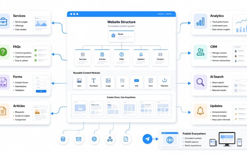
7. Connect the form to the workflow behind it
A clean form is only useful if the submitted information reaches the right person, system, or dashboard. Business interface design should consider what happens after submission: assignment, notification, file storage, approval, calendar booking, automation, and reporting.
- Check: Where does the submitted information go?
- Improve: Connect forms to a CRM, project board, email sequence, booking calendar, or internal system where appropriate.
- Example: A website enquiry can automatically create a lead record, notify the sales team, and send the user a clear confirmation email.
8. Test with real users, not only internal opinions
UX optimization works best as a continuous process. Instead of redesigning everything at once, watch where people hesitate, abandon, repeat questions, or submit incomplete information. Then improve the flow in small, practical steps.
- Check: Where do users stop, ask for help, or enter unclear answers?
- Improve: Test the form on mobile, desktop, and with people outside the project team.
- Example: Ask someone unfamiliar with your business to complete the booking flow and explain what they think will happen next.
A simple review framework
When reviewing any form, booking page, or internal request process, use four questions: Is it clear what this is for? Is it easy to complete? Does it ask for the right information? Does it move the request to the right next step?
This user journey checklist can be applied to website contact forms, service booking pages, support forms, onboarding forms, creative briefs, procurement requests, and internal approval workflows. The same principle applies across all of them: reduce unnecessary thinking for the user and reduce unnecessary chasing for the team.
How better UX reduces support questions
Many support questions are not really support problems. They are clarity problems. Users ask where to upload files because the upload step is hidden. They ask when they will receive feedback because the confirmation message is vague. They ask who must approve something because the request flow does not show ownership.
By improving form structure, labels, confirmation messages, and handovers, businesses can reduce support questions UX issues before they become operational problems. This does not require a huge platform rebuild. It often starts with clearer questions, better sequencing, and smarter workflow connections.
Final thought
Forms, booking pages, and request flows are not just admin tools. They shape how customers experience your business and how smoothly your team works behind the scenes. Digivolve Media helps businesses improve these everyday digital touchpoints through UX/UI Design, websites, systems platforms, automation, and practical workflow thinking, so digital processes become easier to use and easier to manage.