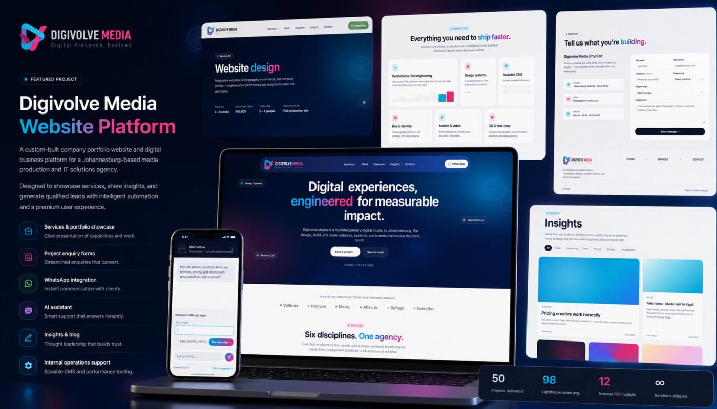
A digital studio, engineered.
Yes — this is the site you're reading the case study on. We built it the way we build everything else: a strong public surface for the work, with an operational system underneath that keeps the studio running. Portfolio, enquiry intake, AI assistant, invoicing, internal task management — one platform, end to end.
The brief, written to ourselves
Every studio reaches the point where its own website becomes the last project on the list. We did, too. After shipping platform after platform for clients — marketplaces, logistics systems, humanitarian tools — our own digital presence was running on a placeholder that didn’t reflect any of the work we’d done. So we wrote ourselves the same brief we write for clients: build something modern, fast, brand-true, and operationally useful. Don’t ship a brochure.
Hero, brand, and a clear point of view
The homepage opens with a single statement of intent — digital experiences, engineered for measurable impact — set against a dark gradient hero with floating capability tags (Design Systems · Motion & 3D · Web Platforms) that signal scope at a glance. Below it: a list of brands we’ve worked with, six service disciplines, and the work that demonstrates each.
No carousel hero, no rotating taglines, no buzzwords. Just a clear voice that holds for the rest of the site.
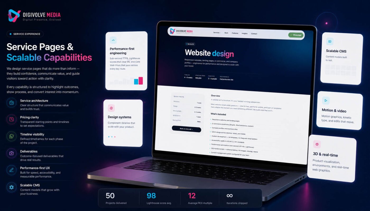
Service pages that do more than inform
Each service — website design, system platforms, branding, motion graphics, 3D, digital solutions — gets its own page, and each page is structured the same way: an honest overview of what’s included, a discovery-to-launch timeline, quick facts (typical duration, team size, starting price), and a deliverables list that tells a prospective client exactly what they’d get. No hidden mechanics.
Pricing transparency is a deliberate choice. We list starting points (e.g., website design from R85,000, 4–8 weeks, 2–4 people) because the prospects who self-disqualify on price would have done so on the first call anyway. The ones who fit get to the project enquiry with the right expectations already set.
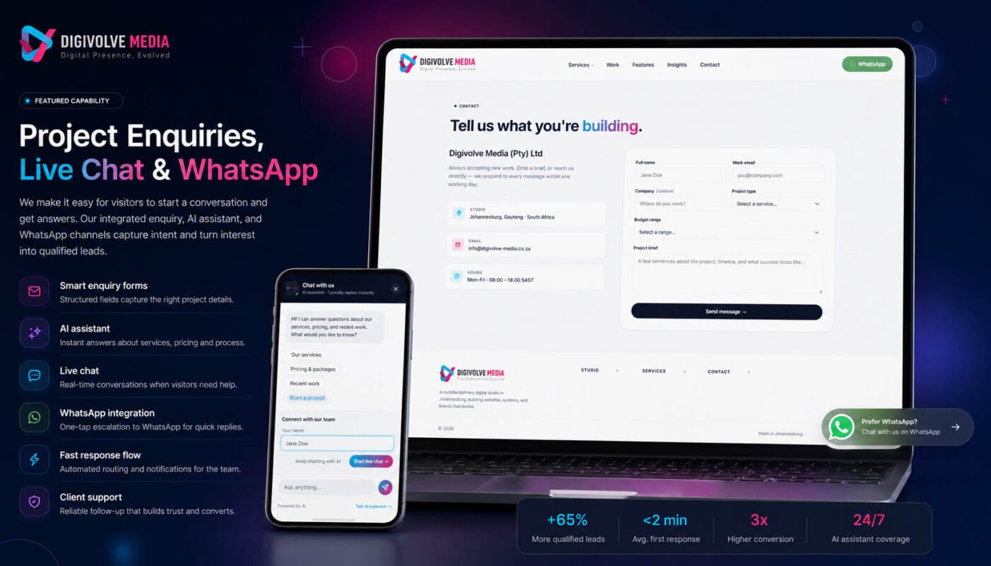
Enquiries, live chat, and an AI assistant that actually helps
The fastest path from interest to qualified lead is conversation. The site has three entry points: a structured enquiry form (full name, work email, company, project type, budget range, project brief), live chat with our team for real-time discussion, and an AI assistant that can answer questions about services, pricing, and past work — drawing on the site’s actual content rather than making things up.
WhatsApp is integrated as a one-tap escalation: if a visitor would rather skip the form and just message us, the button is right there in the header. For a Johannesburg-based studio working across African markets where WhatsApp is the default business channel, this isn’t a nice-to-have — it’s how the majority of new business actually starts.
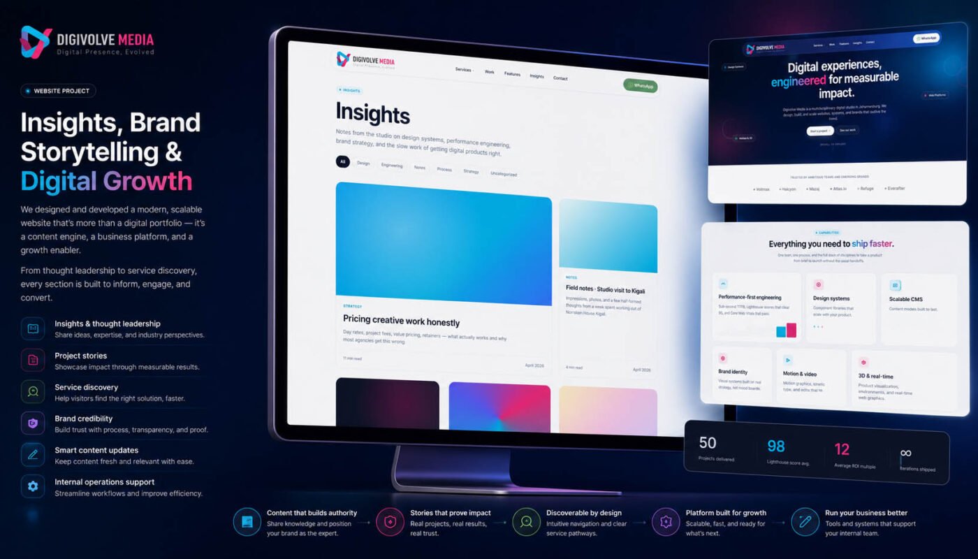
Insights, written like a studio that actually has them
The Insights section is built for thought leadership without the cringe. Notes from the studio on design systems, performance engineering, brand strategy, and the slow work of getting digital products right. Filters by Design, Engineering, Notes, Process, Strategy keep the archive scannable as it grows.
The first few articles are about real things we’ve thought hard about: pricing creative work honestly, field notes from a studio visit, the case for performance-first engineering. The point is to share what we actually know, not to chase keywords.
The operational layer underneath
What visitors see is the front door. What runs behind it is a full operations layer — the same kind of system we build for clients, applied to our own work. Invoicing and quote generation, client and project records, internal task management, and the publishing tools that keep this very page (and every case study around it) up to date.
The CMS is structured so adding a new case study takes minutes, not hours. New services get the same treatment. Performance budgets, accessibility standards, and SEO fundamentals were baked in from the foundation rather than bolted on at the end. Every page targets sub-second TTFB and a 95+ Lighthouse score across the board — the same standards we hold our client work to.
Ship the studio. Then ship the work.
Three weeks from kickoff to launch. Five core pages, ten platform features across the public site and the operational backend, six disciplines covered across services and case studies. The deliberate scope was small because the deliberate purpose was clear: build the right foundation for everything that comes next, and ship.
You’re reading the result.