A food brand, served fresh.
We built Hawaii Garden's online home end to end — from the brand visuals and product photography to the catalogue structure and the shopping experience itself. Olives, oils, jams, pickles, floral waters, tahini, and bakery essentials — a Middle Eastern pantry, made browsable.


The brief
Hawaii Garden is a Middle Eastern food store with the kind of catalogue that rewards curiosity — Kalamata olives by the jar, traditional pickles, cold-pressed oils, floral waters, tahini, bakery essentials, jams and spreads in colours you only get from real fruit. The challenge wasn’t the products. It was translating them online without losing what makes them feel handmade.
We were brought in to build the whole thing — brand presence, product photography, catalogue structure, the shop itself, and the small details that make a food site feel inviting rather than industrial.
Product photography, done right
Food photography is a craft that rewards patience and punishes shortcuts. We shot every product from scratch — clean studio lighting for the catalogue, atmospheric lifestyle compositions for the homepage and category pages. Olives on a wooden board with herbs and citrus. Oils glowing against a soft natural background. Jams catching sun on a kitchen counter at golden hour.
Then every shot was edited — colour-corrected, backgrounds cleaned, light balanced — so the catalogue holds together as a visual whole, not just a stack of product photos. The result is a shop that looks like a brand, not like a spreadsheet.
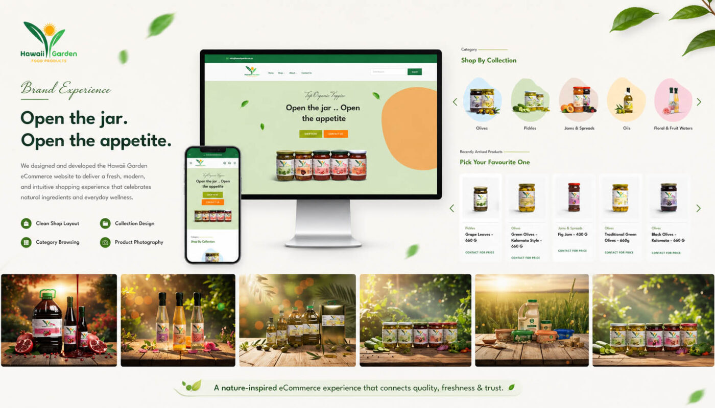
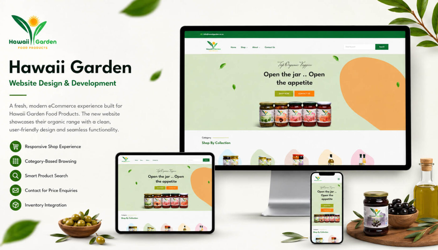
A homepage that opens the appetite
The homepage tagline — Open the jar. Open the appetite. — sets the tone. A warm hero scene with the product lineup in sharp focus, a soft organic palette of greens, creams, and earthy tones, and gentle floating leaves on the page edges that nod to the brand mark without overpowering it.
Below the fold: “Shop by Collection” pulls the categories into the open — Olives, Pickles, Jams & Spreads, Oils & Vinegars, Floral & Fruit Waters — each with its own soft-shape backdrop and a hero product image. “Recently Arrived” surfaces the newest additions. Everything you’d want from a food site, presented with the calm confidence of a well-stocked pantry.
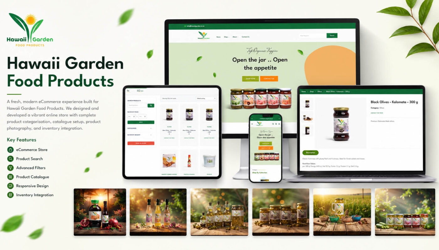
A shop built around how people actually browse
The shop page is the working heart of the site. 49 products, structured into five collections, browsable by search, price, weight, and category. We kept the product card simple and consistent: clean image, category label, product name, weight indicator, and a “Contact for Price” call to action — because Hawaii Garden’s wholesale pricing model is enquiry-based, not transactional.
That decision shaped the whole shop. Instead of optimising for checkout abandonment, we optimised for browse depth — making it easy to discover related products, drift into a category, and end up reaching out about three jars instead of one. The filtering is fast, the catalogue loads quickly, and the page never gets in the way of the food.
Product pages that close the loop
Each product page does three things: shows the product properly, tells you what it is in plain language, and points you to related items. Multiple product images with thumbnail navigation. A short, honest description (“Classic Kalamata with plump flesh and fruitiness. Ideal for Greek salads and mezze”). Nutrition information where it matters. A “Contact for Price” enquiry that connects directly to the team.
The Related Products section underneath isn’t filler — it’s curated to fit. Looking at olives? You’ll see other olives, tahini, and the kind of pickles that go on the same plate. The site teaches itself to a new visitor by showing what belongs together.
Built fast, built right
Four weeks from kickoff to launch: 13 pages designed and built, 49 products photographed and catalogued, five collections structured for discovery, full responsive design across desktop, tablet, and mobile. Hawaii Garden launched with an online presence that does its food justice — and a catalogue structure built to grow with the business.
Some projects need a control tower. This one needed a market stall — and a really good one.